ING Quest
is a feature added to the existing ING app to teach financial sustainability to kids & save money for their future
CLIENT
ING representatives
Ines Henrique Lopes- Project Owner
Filip Mishevski- Project Owner
TIMELINE
September 2022- November 2022
TEAM
Fatima Tari- UX Researcher- Designer
Eva Valentine- UX & Graphic Designer
Carolina Masuero- UX/UI Designer
MY CONTRIBUTIONS
UX Research, Design & animation
Introduction
ING Quest is a challenge feature designed to be added to the existing ING app. In this challenge, kids can collect points by scanning lion sculptures around the city. This sculptures are made of recycled materials and the challenge teaches kids about their spending impacts on the planet along the way.
Doing the challenge as a family can be a fun way to educate the family on financial sustainability and encourage parents to save money for the future of their kids in their savings account.

Quiz & Reward
Go & Scan
Find a Sculpture
Join in
What?
Create an engaging feature for the ING app that teaches children about financial sustainability and encourages saving for their future.
Activities
Conducting field studies, surveys, user and stakeholder interviews, defining requirements and goals, and UX road mapping.
Why?
To foster responsible financial behavior in children while promoting sustainable living, ensuring a better world for future generations.
Activities
Analyzing data from initial research to create stakeholder prioritization, user personas, and journeys, while defining both primary and secondary goals that align with ethical design guidelines.
How?
To design and test a feature that effectively combines financial learning with real-world engagement through an interactive experience.
Activities
Creating sitemaps, wireframes, and user journeys, followed by prototyping, usability testing, and iterative refinement based on user feedback. The feature would include an AR experience where children scan lion sculptures around the city to learn about sustainability and earn rewards.
Are you ready for a detailed process? You can also jump
Straight to the APP?
Defining the Target Users
The ING app features "ING Go to 18," a thoughtful tool allowing parents and grandparents to save for their children's futures. For our project, we zeroed in on a specific audience to better understand and design for their needs:

10-12 year-olds
Pivotal age for understanding nuances
Moving beyond black-and-white thinking
Beginning to grasp financial independence and responsibility

& Their Parents
Key in guiding children
Support children's financial learning
Essential to fostering financial savvy
Challenge #1: Why Kids First?
87% of parents confirm their children’s influence on some aspects of their purchases - either buying household items or items for their kids (National Retail Federation, “Consumer View Fall 2019).
Financial education of children has a real-world sustainable impact, as was the main context for this project. Seeing children learn about money management can make parents more confident in their kids' ability to use savings wisely. This encourages parents to save more, which is the main goal from the brief.

81%
of young people experience financial anxiety in 2021
(London Institute of Banking & Finance, 2021)

72%
of kids want to learn about finances in school
(London Institute of Banking and Finance, 2021)

93%
of the teenagers financial knowledge is essential for them to achieve their goals in life. (Forbes, 2022)

56%
of young adults wish they’d started financial learning at an earlier age (London Institute of Banking & Finance, 2021)
Challenge #2: Surveys
Initially, we decided to conduct a survey (one for kids and one for parents) to find out about their financial and sustainable behaviors. Based on the response rate we gathered in the initial stage, we realized the scope of the project does not allow us to draw meaningful conclusions from the quantitative data in the 8 week time-frame.
In this survey we asked users about their age, sustainable actions, financial knowledge, family behaviors regarding money, saving and spending behaviors, and media of choice.
Qualitative User Interviews
Next, we jumped to interviewing users in a semi-structured way. We asked questions trying to understand more in depth on:
Kids’ financial knowledge and behavior
Child-parent relationship when it comes to finances and saving
Family activities, especially sustainability related ones.
Kids’ online activities and interests
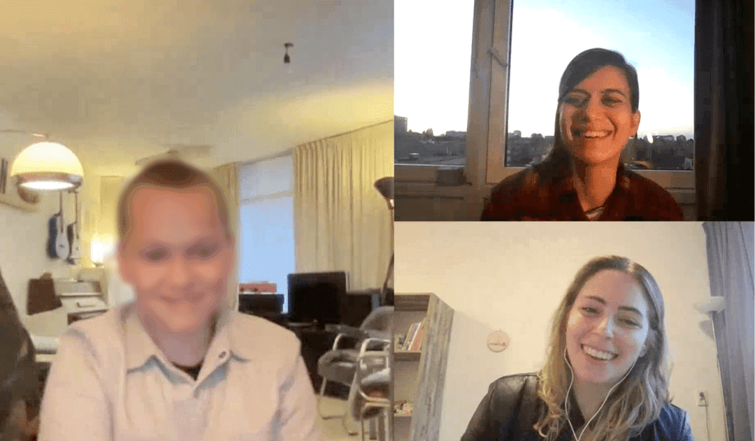
We interviewed 6 users, 3 kids between ages of 10-12 and one of their parents. From the interview scripts, we draw user personas, and user journey maps.
Children
Saving money is hard for them, because they mostly purchase impulsively.
They have a very basic understanding of sustainability
They enjoy playing online games with friends (e.g., PokemonGo), and outdoor activities (walking around with family and friends)
Parents
Their savings goal is to secure their children's financial independence.
Savings are automated monthly, leading to infrequent account checks.
They wish for their children to appreciate money's value, so they understand the significance of financial literacy.
Insights & Observation
Stakeholder Interview
In the Discovery phase we interviewed the client representatives to debrief the brief, define goals and success metrics, and understand clients requirements and constraints. We also asked about any initiatives they have taken, and or data that could be helpful for this particular feature.
Throughout the project timeline, we had bi-weekly meetings with the client to update them on the progress and ask for feedback.
Short-Term Goals
Creation of a solution that can offer real positive impact in the world (not greenwashing)
Children feel they improve their knowledge about financial decision from the experience
Children feel motivated to use the experience on a regular base
Parents feel the experience has a positive impact in their child financial education
Long-Term Goals
Saving amount account increases
More savings accounts are created
Conversion from children who start with savings accounts to becoming regular customers as adults is high.
NPS of the experience is high
High social media interactions and shares related to the experience
Experience improves financial knowledge of the children
Doing a session of 'how might we's, and thematically analyze them we decided to primarily focus on kids’ financial education and their environmental impacts, and to encourage parents to save more money as a secondary goal. This decision was also made based on ethical considerations.
Primary Goal
How might we create an engaging and fun experience that educates kids about taking more financially sustainable decisions?
Secondary Goal
How might we encourage parents to add more money into their children savings account?
Stakeholder Mapping
In mapping the stakeholders, we exercised two types of analysis. First, we mapped them out based on who is an internal stakeholder (i.e. directly involved in making decisions or being immediately effected by the project), and external stakeholder (i.e. not directly involved but effected by the outcomes).
Then we categorized them based on a power-interest perspective to see who should we keep satisfied, manage closely, monitor, and/or keep interested.
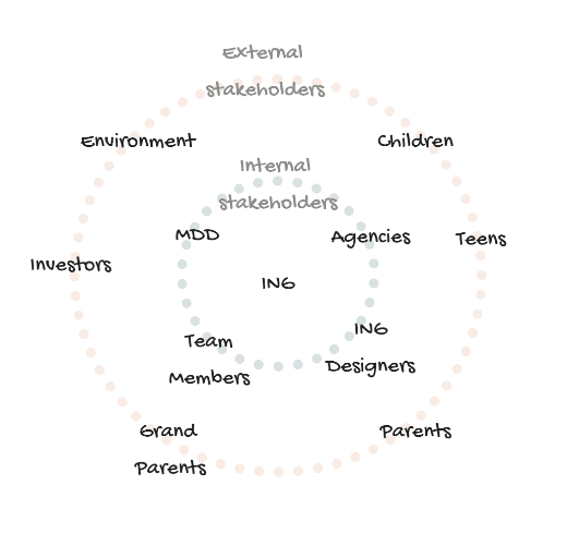
Internal-External stakeholders

Interest-Power Analysis
User Personas & User Journeys


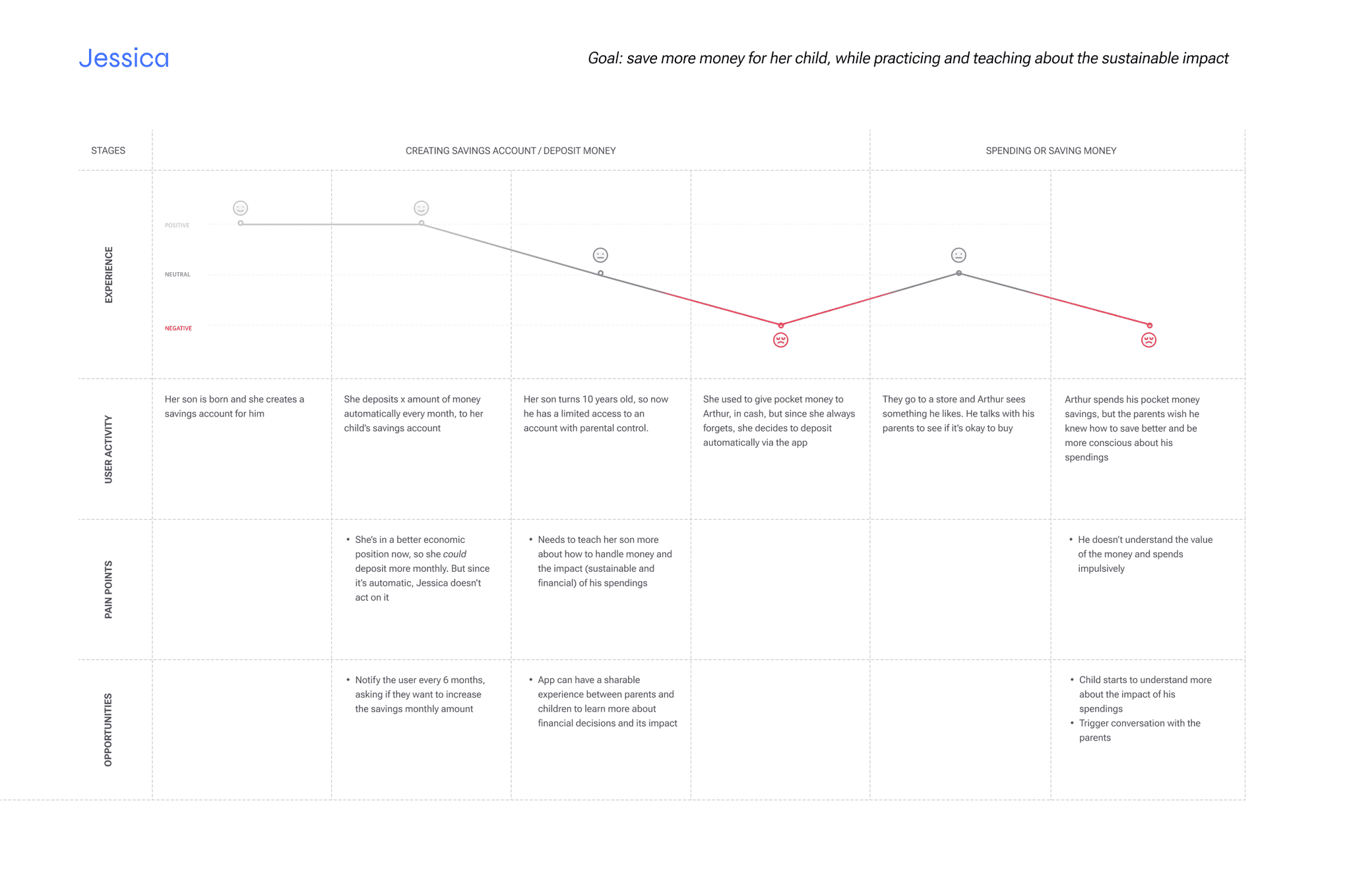
The idea is to take the kids to the real world with this feature. Lion (ING mascot) sculptures are scattered around the city, made out of recycled material in collaboration with local artists. When the user scans a lion, they learn a lesson about their spending’s effect on the environment and financial literacy to get points. The points can be exchanged for rewards from the app.
Family’s are encouraged by the app to do this together and get more points, and parents are reminded to save for the kids in different stages of the feature.
We imagined two types of interactions with the sculptures:
Intentional Encounter

Heading to the next one?!
Unintentional Encounter

This was fun, maybe we should find another one? Or join the quest?!
Concept Testing
For testing our concept, we made a prototype of a lion made out of recycled jeans. Then we generated a question that teaches the user about the impacts of buying jeans. If the user scans the QR code, they see the Google-form question and we can record their interaction/reaction.
We did two round of testing:
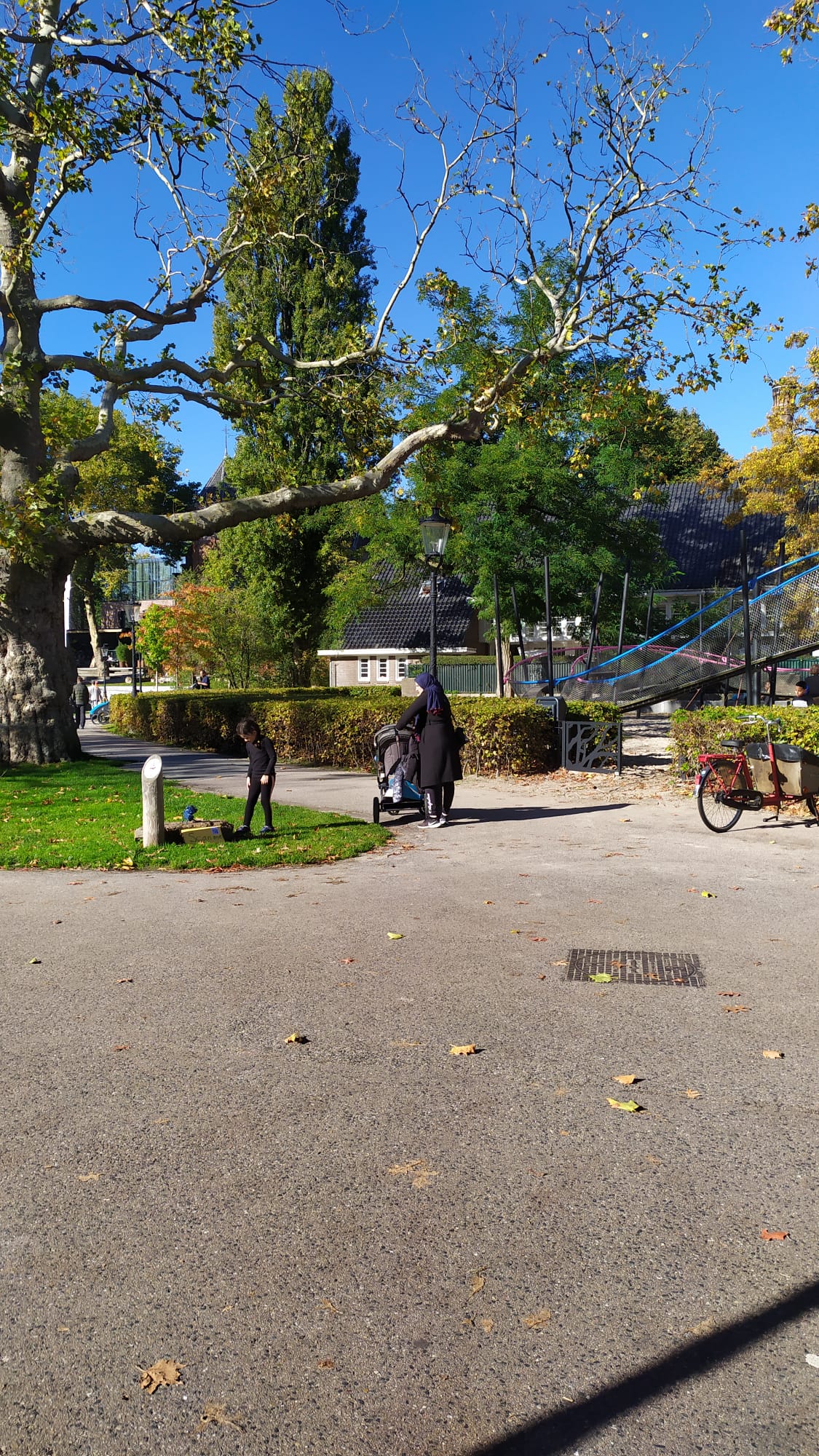
Unintentional testing, in which we placed the sculpture in the Oosterpark, and recorded passengers’ reactions.
Intentional testing, where we reached out to people and asked them to test the prototype and answer the questions.
General Reactions
Findings & Insights
1st Round
We observed several friendly reactions to the prototype. People would look and smile, some of them got closer to take a look.
For the sculpture to call attention, it needs to be much bigger
People have friendly reactions
2nd Round
People were shocked to know about the amount of water-usage in denim. They said they feel more aware now.
Prototype attracted kids
People took their time reading the questions and answers carefully.
Parents had a positive reaction & said it would be interesting to do it with kids to teach them about their impact.
Use age-appropriate vocabulary (‘jeans’ instead of ‘denim’, for example).
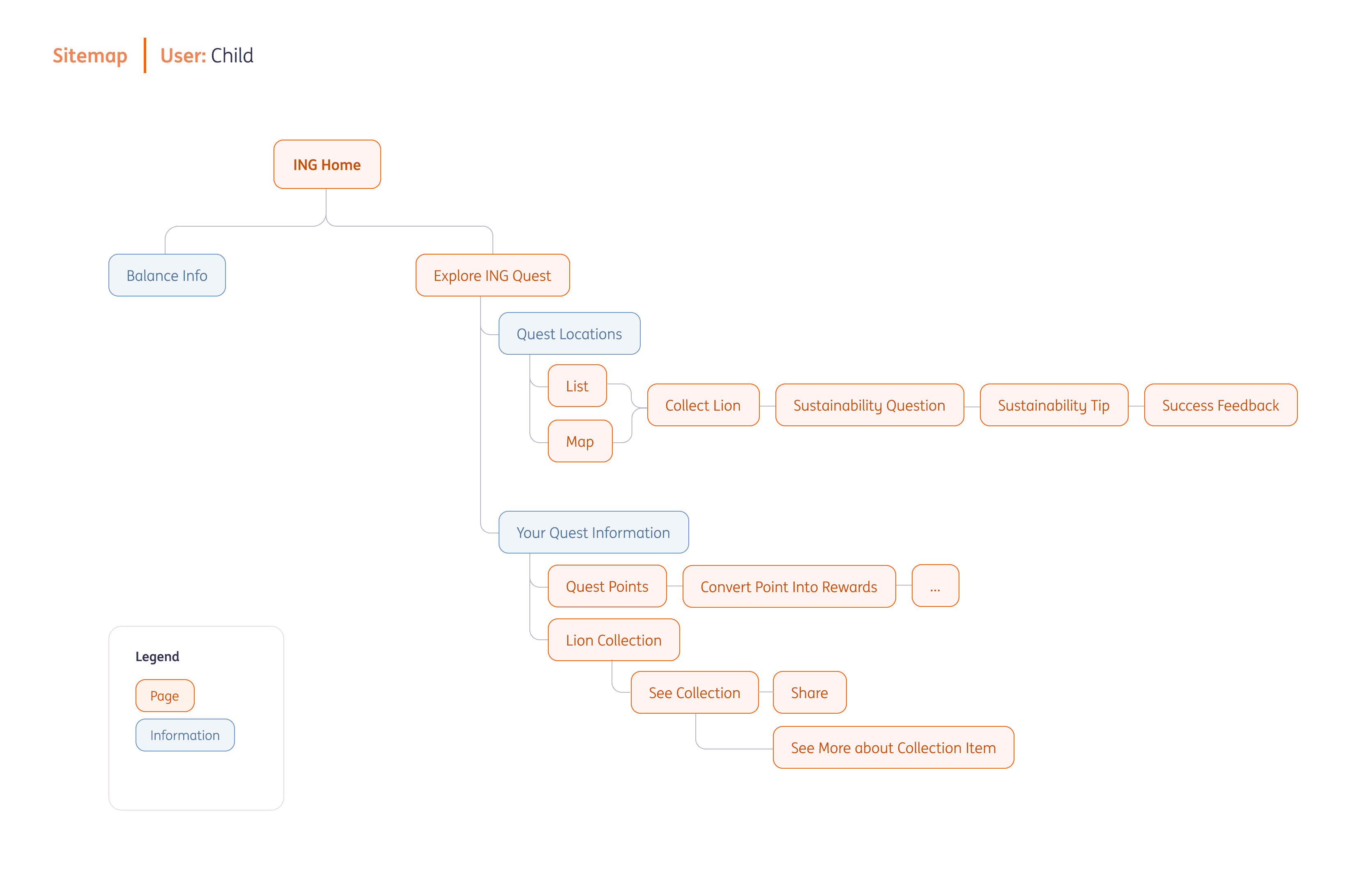
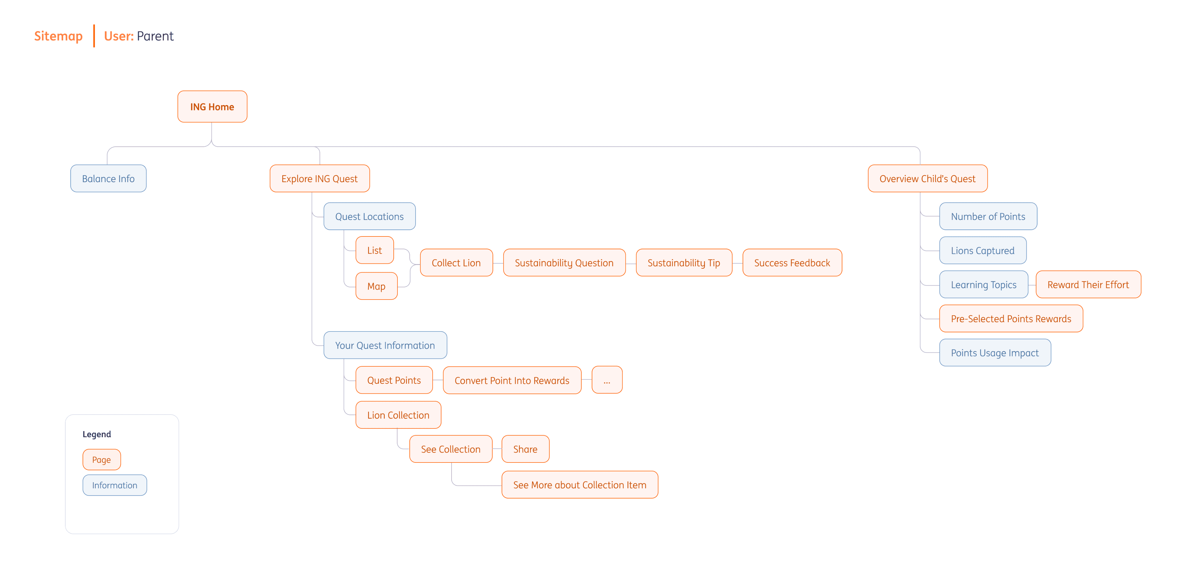
Based on all the information we gathered from interviews and user-testing, we created sitemaps and user journeys both for the child and the parent to start developing wireframes…
Sitemap
User Journey

Wireframe
After the concept of the experience was more defined, we started to draw wireframes to show how the app would look like. First we started with hand-drawn wireframes, which was followed by digital ones.
These were used in presentations and group discussions to get feedback and do iterations.


Ready to take a look at the final prototype?…
Final Prototype




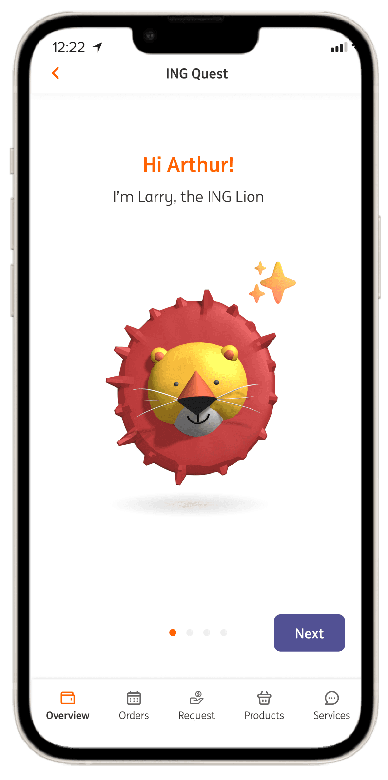
Go to the real world with Larry the lion!
The feature starts with an unboarding story to familiarize and engage kids!
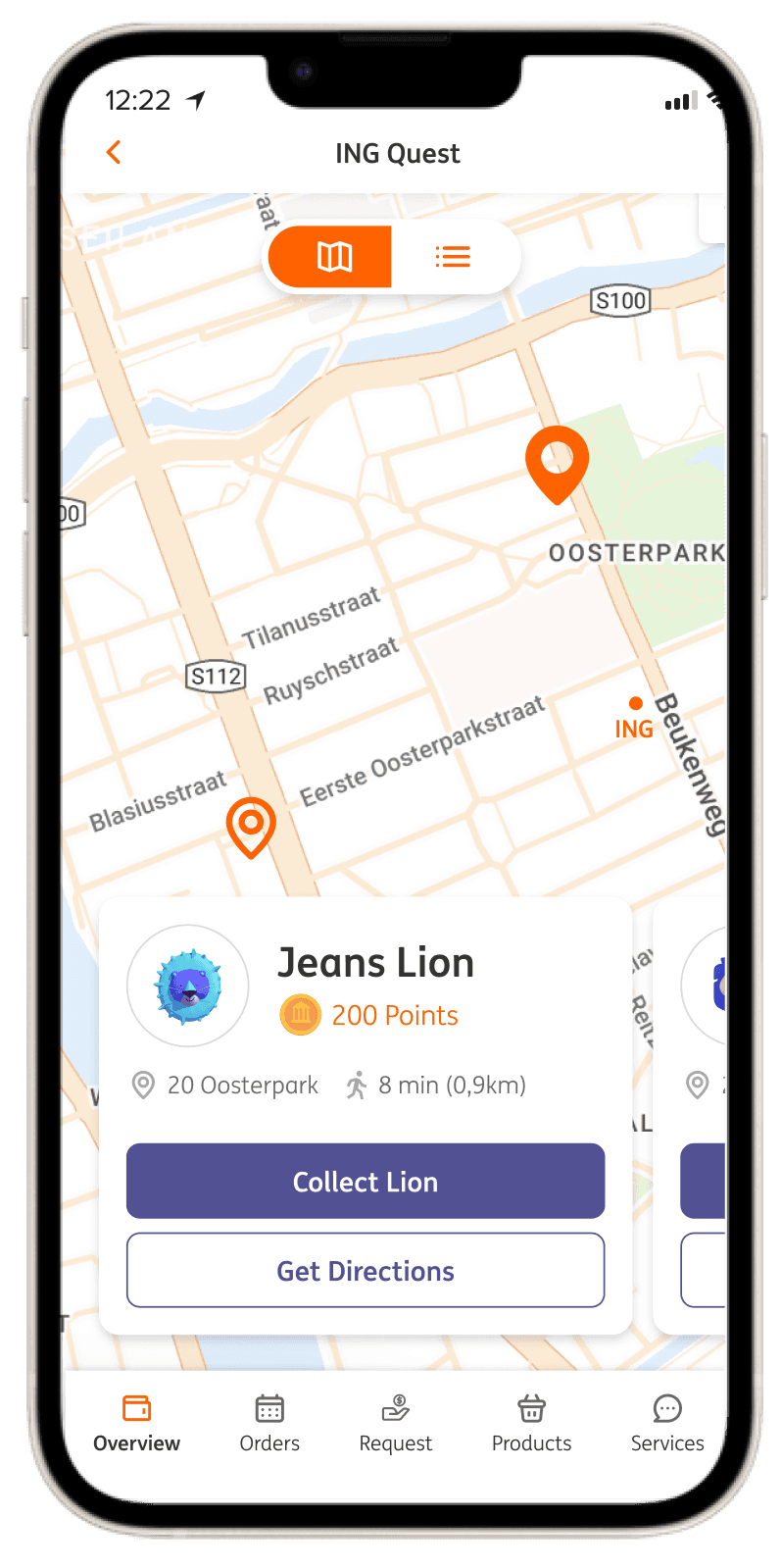
Explore the city on a hunt!
Find the sculptures in the city through the map to collect lions!
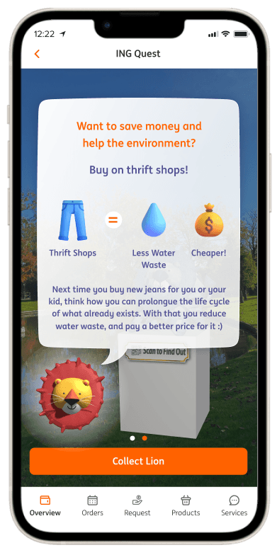
Scan to learn through an AR experience!
Each time the user scans a lion, they answer a small quiz about finances and the environment. It is fun, and it teaches kids little by little about sustainability and finances!
Turn your points into rewards!
The user can exchange the points obtained from quizzes to choose from a list of exciting rewards: cultural activities, donations, and sustainable shops.


Are you the Parent? Join & Support your kids!
Parents can learn about what their kid is learning, check their activities, and gift them for their efforts. The gift is deposited to their savings account, and also turns into points for the present.
Usability Testing
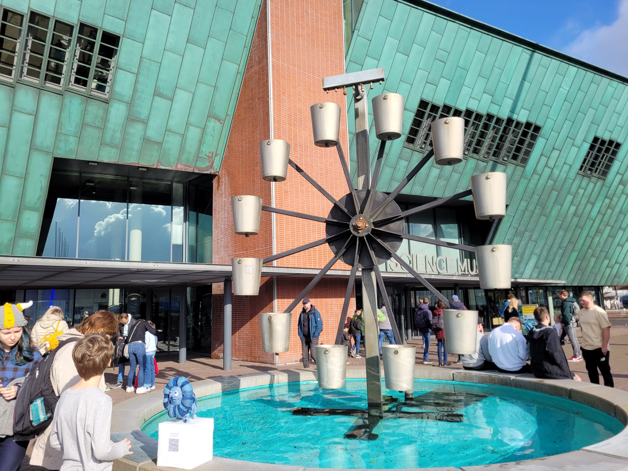
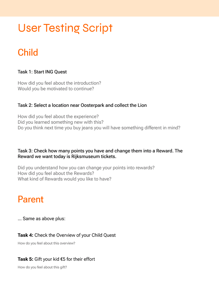
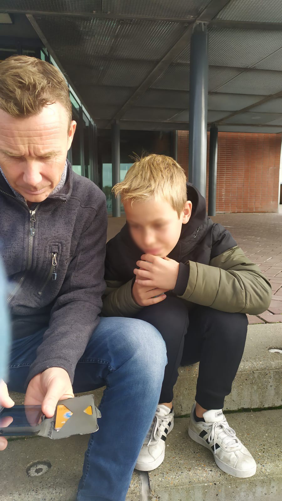
As the final part to the project we conducted user and usability testing at Nemo museum. We tested the final prototype with 4 kids and 2 parents. We made a list of tasks and asked users to try the prototype out.
Insights from the User Testing
Due to user’s limited time and patience, not all questions from the script were possible to be made
The sculpture gets people’s attention and friendly reactions
The app allows a sharable, family moment (question moment)
It showed to be a successful experience in raising sustainable awareness, as everyone had a reaction of surprise in fiding out the information.
More testing with current ING account holders is advisable
Adding Dutch is suggested.
More and continuous testing is advisable

Reflections for the Future
What Next?
Assess the feature's impact on children's learning and parental savings behavior, and identify opportunities for improvement and expansion.
Activities
Analyzing feedback and reflections, understanding what went right for future replication, and identifying areas for improvement. Suggested future activities include iterative prototyping, impact analysis, community building, comparative usability testing, and behavioral analytics to deepen user understanding and enhance the app's design and functionality.
More Works …
It's not Simple
Immersive, multi-perspective exhibition design on unconscious biases (coming soon…)
Back to Top


