Special Story
An AI empowered app to improve families’ literacy through play
CLIENT
Fonk- Niels De Keizer
TIMELINE
March 2023- June 2023
TEAM
Fatima Tari- UI/UX Designer
Laura Klimate- UX & designer
Elise Esboom- Digital designer
Matte Olah- Digital designer
MY CONTRIBUTIONS
UX Research, UI Design, Gamification
Introduction
Kids today find reading more challenging. Shorter attention spans and less interest in books are big reasons for this, while social media and learning online, especially during COVID-19, have made this worse.
With reading difficulties on the rise, traditional education methods are struggling to keep up. Yet, reading at home remains a vital part of the solution, despite many kids not finding it enjoyable or battling low confidence in their literacy abilities.
Enter technology - kids already spend a lot of their time on apps. Instead of fighting tech, why not use it to bridge the gap to books? Special Story does just that. It's an app that turns reading into a game, making kids eager to dive into stories and tackle comprehension challenges. They control the story, making reading an adventure they're excited to share. Simple, engaging, and effective - Special Story is the step forward in making reading fun again.

What?
To improve literacy among families, by leveraging technology to make reading enjoyable and engaging.
Activities
Define the target group, explored literature around literacy, competitive analysis, explored AI possibilities, situated exploration interview, expert interviews, and identified issues such as the rise in reading difficulties and the decline in interest in traditional books.
Why?
To motivate kids to read at home with their parents and improve literacy through an engaging, game-like app experience.
Activities
Stakeholder mapping, clarify project scope, ideation sessions, goal definition and journey mapping.
How?
To design and test a prototype of the app that would turn reading into an adventure and comprehension into a game.
Activities
Creating sitemaps, wireframes, and prototypes of the app, usability testing, and integrating AI features.
Are you ready for a detailed process? You can also jump
Straight to the APP?
Defining the Target Users
In the Netherlands, 2.5 million people have difficulty with reading, writing, and/or arithmetic.
22% of population over 12 have little or no ICT skills
Low-literate are twice as likely to be long-term poor
(Stiching Lezen en Schriven)


We decided to target families with 7-12 year-olds, since they are starting to develop reading skills.
Exploring Literature around Literacy
As low-literacy is a social problem, we looked into these concepts to implement them in our project:
Social Implication Design (SID)
Social Cognitive Theory
Studies regarding kids (7-12) and literacy
Dialogic reading
01
“Stimulating parents
to engage in more home literacy activities might prevent children’s reading interests from dropping during primary school”.
02
“Parents perceive their child’s reading interest and adjust their own negative feelings towards reading if they perceived their child was interested”.
03
“Gamification has been widely used in e-learning to increase learners’ learning motivation and engagement.”
Competitive Analysis
We also looked into existing apps/games that encourage children to read. A lot of them had some kind of library with age-appropriate books in categories. Some of them used interactive strategies and comprehension tests to make it both educational and engaging.
Spark Reading for Kids
kids with 6-16 year old
Sora, by OverDrive Education
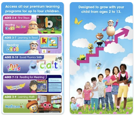
Reading Eggs
kids with 2-13 year old
Swap Tales- Leon!
Categorized
Library
Comprehension
Tests
AI Assistance
Multiple
Languages
Level Quizzes
Gamification
Features
Score system
Level system
None
Difficulty levels
In-game quizzes
Characters
Choice driven narrative
Character development
Additional
Features
Academic subjects covered
Aligns with school curriculum for homeschooling
Track & monitor for parents & teachers
No info collected
Connects to each school system
Audio books
Save books to google drive
Age appropriated library
Including educational subjects like math.
Reports to track kid’s improvement
Swapping words to change the story
puzzles
30 alternative endings



Exploring AI Possibilities
As we had the opportunity to collaborate with AI students from Amsterdam University of Science and Technology in this project, we held a meeting to explore the possible AI features that can be embedded in the app, as well as their benefits and limitations.
a text to speech feature to assist kids with difficult words
a speech recognition feature to track accuracy in reading (which is hard to implement perfectly, because of different accents and tones.)
Lipsyncing feature to add lip-sync games
Image generator models using prompt to create images for the books (which might not be appropriate for kids because of these models’ unpredictability.)
Situated Qualitative Interview
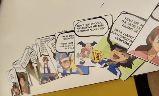
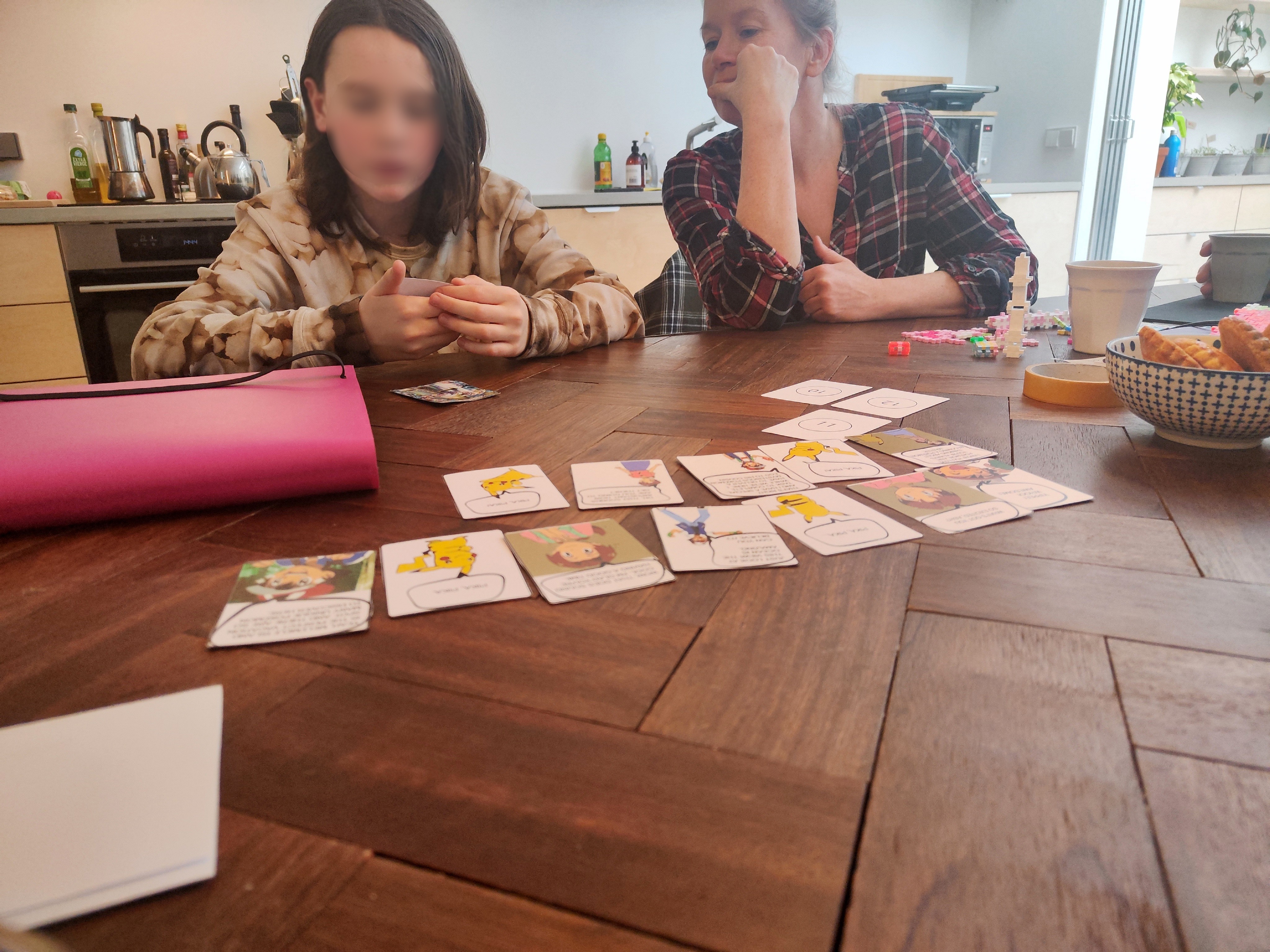
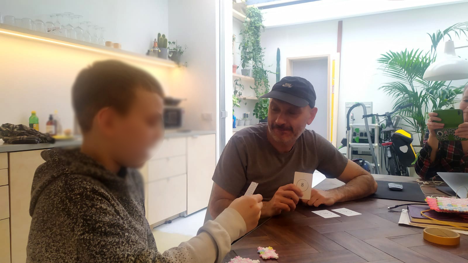
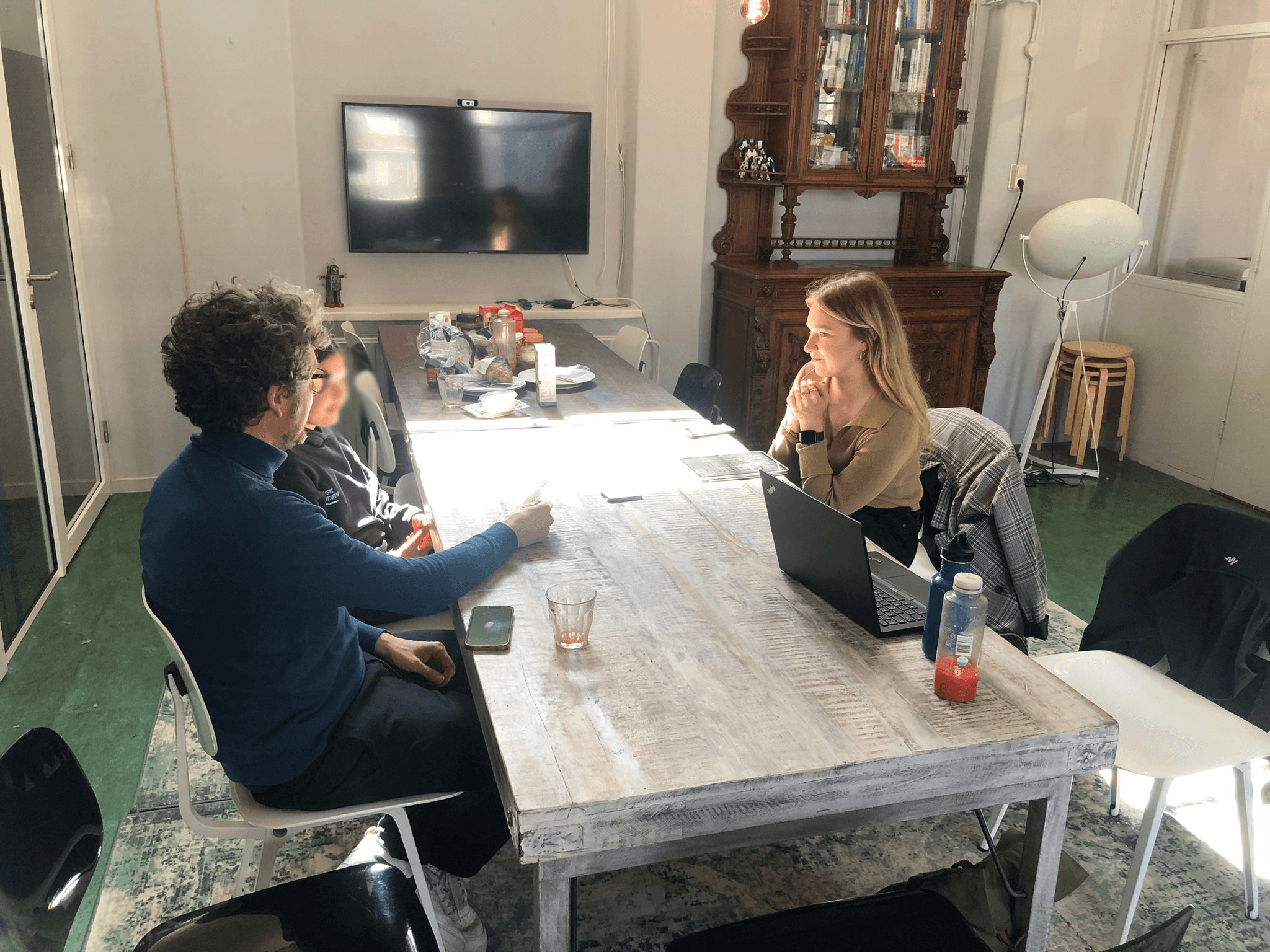
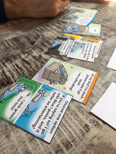
As a situated practice, we used a reading card game as props to get to know the audience. We created a focus group of two 9 years old boys and two parents. The boys played the card game with a parent. Our main observations were:
Kids were comfortable and engaged.
They said they liked the game.
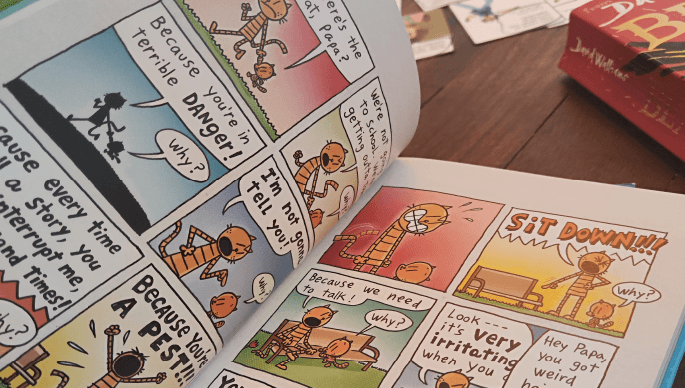
They like comic books more than regular books.
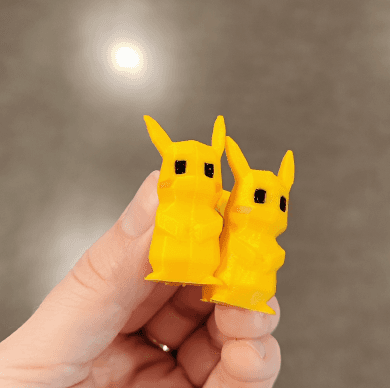
They play boardgames and physical games with their parents. They also are a fan of PokemonGo and collect Pokemon cards.
They read books before they sleep with their parents as an assignment from school.
One kid played the game and got into character.
Experts Interview
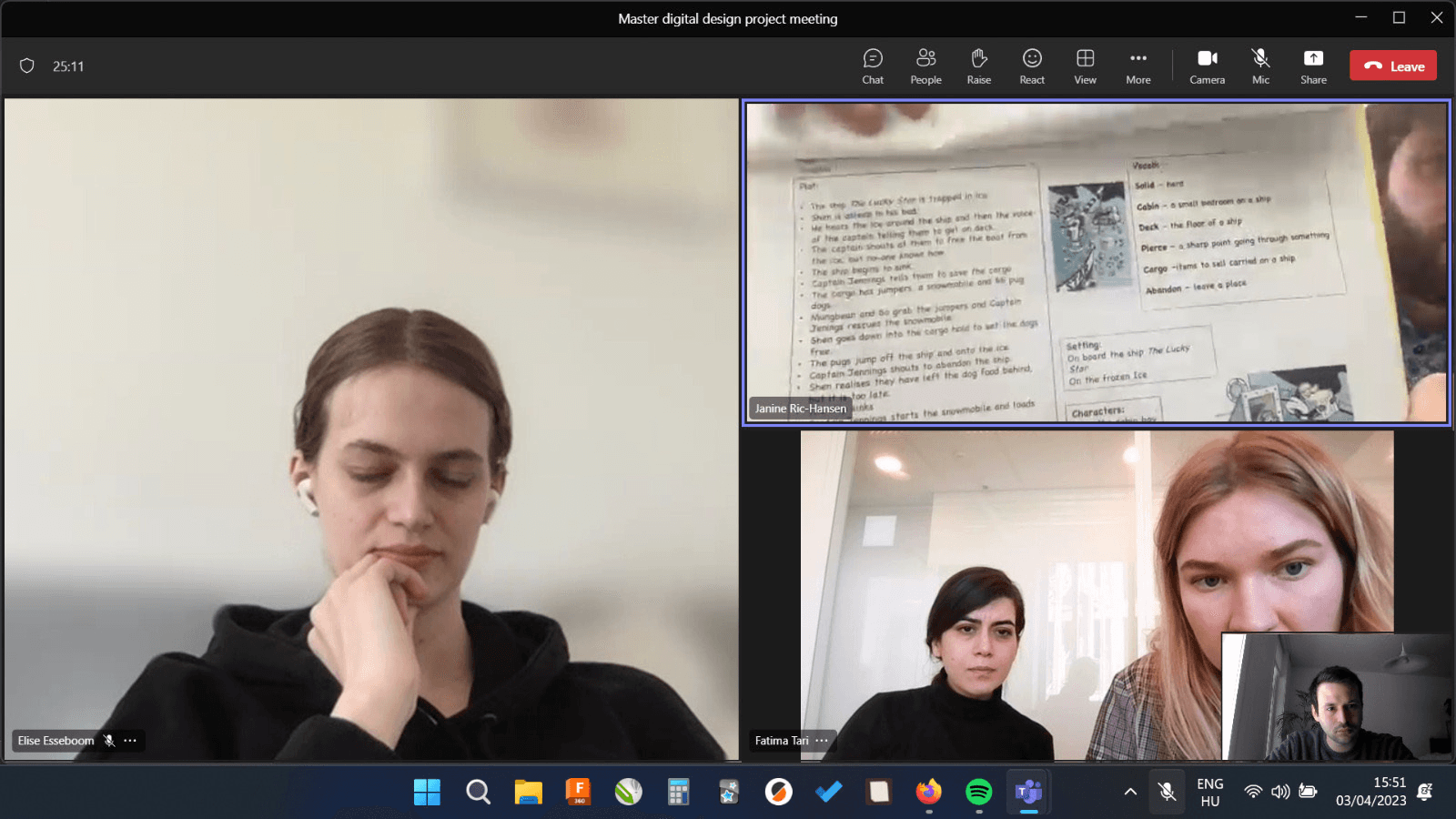
We interviewed two school teachers, working specifically with kids who have problems with reading (all ranges of problems: Dyslexia, second language learning, etc.)
They had great insight into teaching strategies and methods to make the learning fun and engaging, such as using existing game-apps, using speech to text for kids as assistive methods, using comprehension tests, baseline assessments and common difficult words.

Suggestions from Experts
Comprehension tests: summary, predict, clarify, question
Knowledge Organizer: used in Dungeons & Dragons, keywords, key characters, summary
Baseline assessment
Common challenging words
Ownership, Brain breaks, No instant gratification
*The brief mentioned addressing low literacy, but after a conversations with the client, Fonk, realizing the scope of the project, we decided to stay away from the term “low-literate” and instead focus on improving literacy at home.
How might we design a fun, engaging experience to motivate kids (7-12 year old) to read at home with their parents, to improve literacy*?
Ideation & Journey Mapping
Initially, we defined our ideas into two main concepts:
A simple story-line with in-game challenges
A choice-based storyline
Then, we created a simple journey map for testing each concept:

Concept 1- Simple story-line with in-game challenges

Concept 2- Choice-based storyline
Prototyping
Considering the Minimum Lovable Product, and prototyping for kids, we made a paper prototype with a digital helper, not to underwhelm the kids with a low-fi prototype.
For the prototype, we used the main characters from a famous kids' book called CATWAD, mentioned in the situated interviews.

Simple story-line with in-game challenges

Choice-based storyline
After a crit session with coaching agencies and a team discussion, we combined two ideas to one: A choice based storyline with in-game comprehension quizzes.
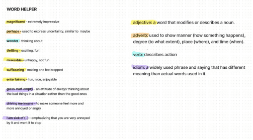
We also explored the possibility of color coding words and a “word helper” that works as the knowledge organizer.
Concept Testing
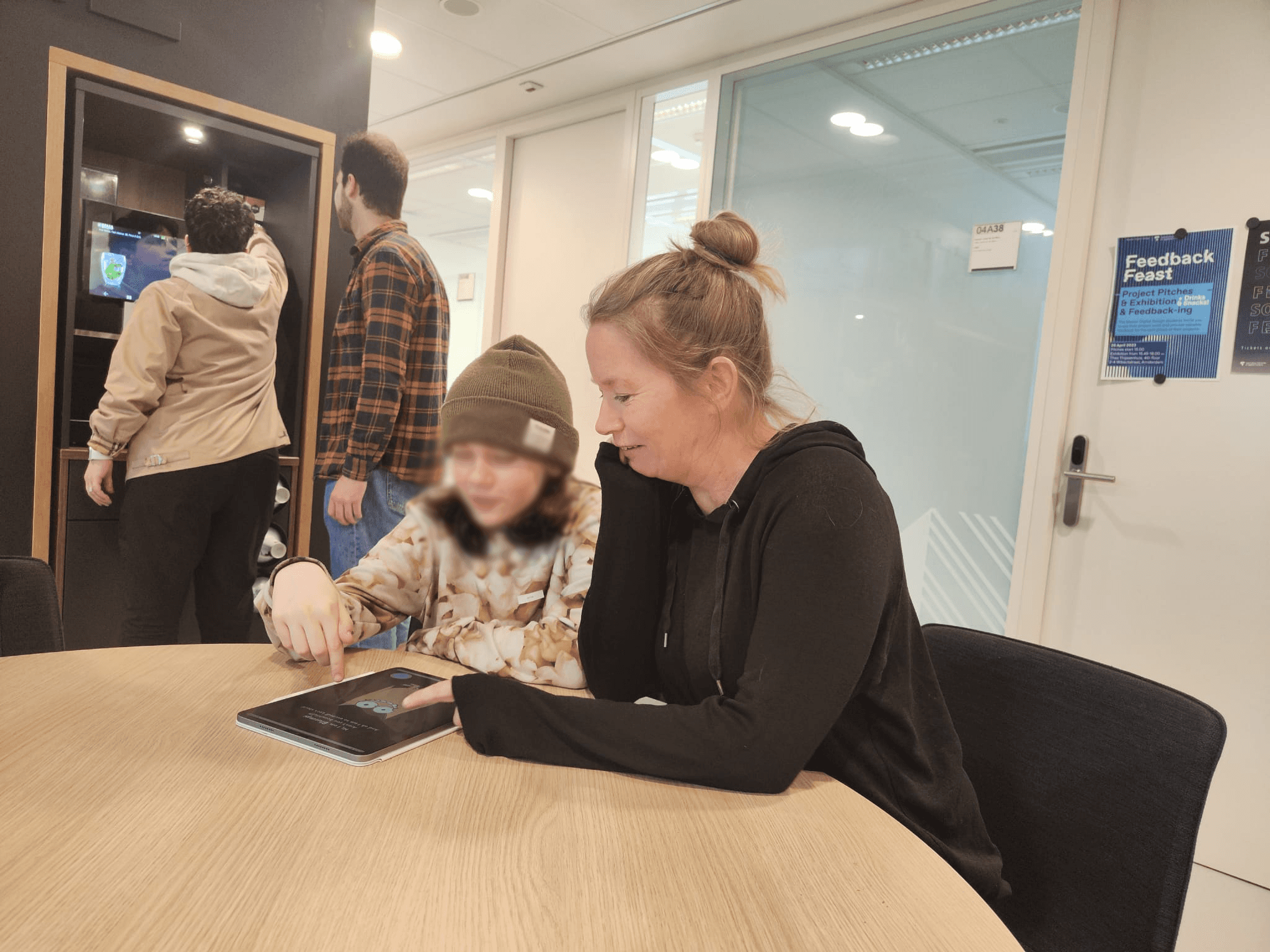
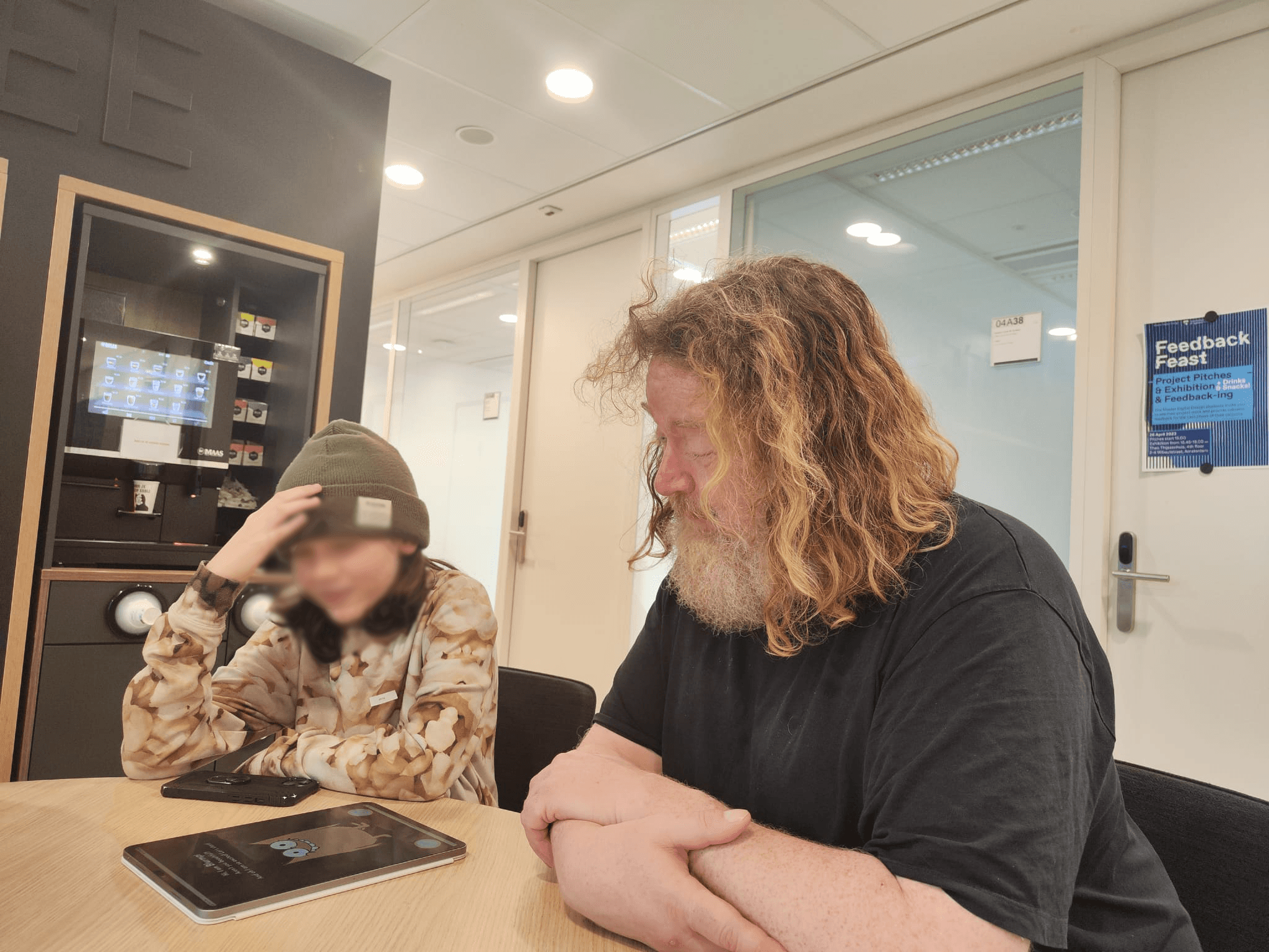
We did concept testing with Niels and his daughter, to observe their interaction with the reading game.
Concept Testing Insights
She thought it was fun and cute
The explanation written on top of the cards were not read, so we had to explain
She liked picking the storyline, and played it again with the other options
She said it is difficult to say what happened in the story
She said physical cards are very fun because you have them in front of you
First cards as onboarding should be easier
The story was very short
Niels also gave us feedback to eliminate the color-coding and word helper to make it more simple. Also, to use a reference to find out about difficult words for each age group (or an AI feature recognizing the level).
It's time to develop the app…
Sitemap & Wireframes
The sitemap shows how the interactive story unfolds, and how in-game challenges and award system of the app works. We then turned the sitemap to a wireframe to discuss and get feedback for the final Prototype.


Unboarding

Interactive Play


In-game quizzes
Figma Prototype
This prototype was built to show a simple part of the game to test for usabality as well as engagement.

Usability Testing
We tested the final prototype with Otto, to get feedback on usability testing and future improvements. These are the main insights from testing, and suggestions from the parents (who were also UX designers):
Make the quizzes harder, for example by including two words that could be the answer.
Increase font size for certain words, like “the world’s worst children” kids book
Add sound expressions.
In the 1st round he pressed on the character instead of the word, but was ok after.
They got more comfortable and laughed by the end of the first round.
We asked if they want to play with a different storyline and the answer was positive.
While playing with their mom, got into character and played more confidently.
They said “it is better than books because everything is spread out and not cramped”. They found the picking card part fun.
Quizzes are fun and we should include more of them for it to be more interactive.
We delivered the app at this stage, but I kept developing the UI, and gamification further as an afterlife to the project. Want to see what I did next? Just keep scrolling!
Style Guide
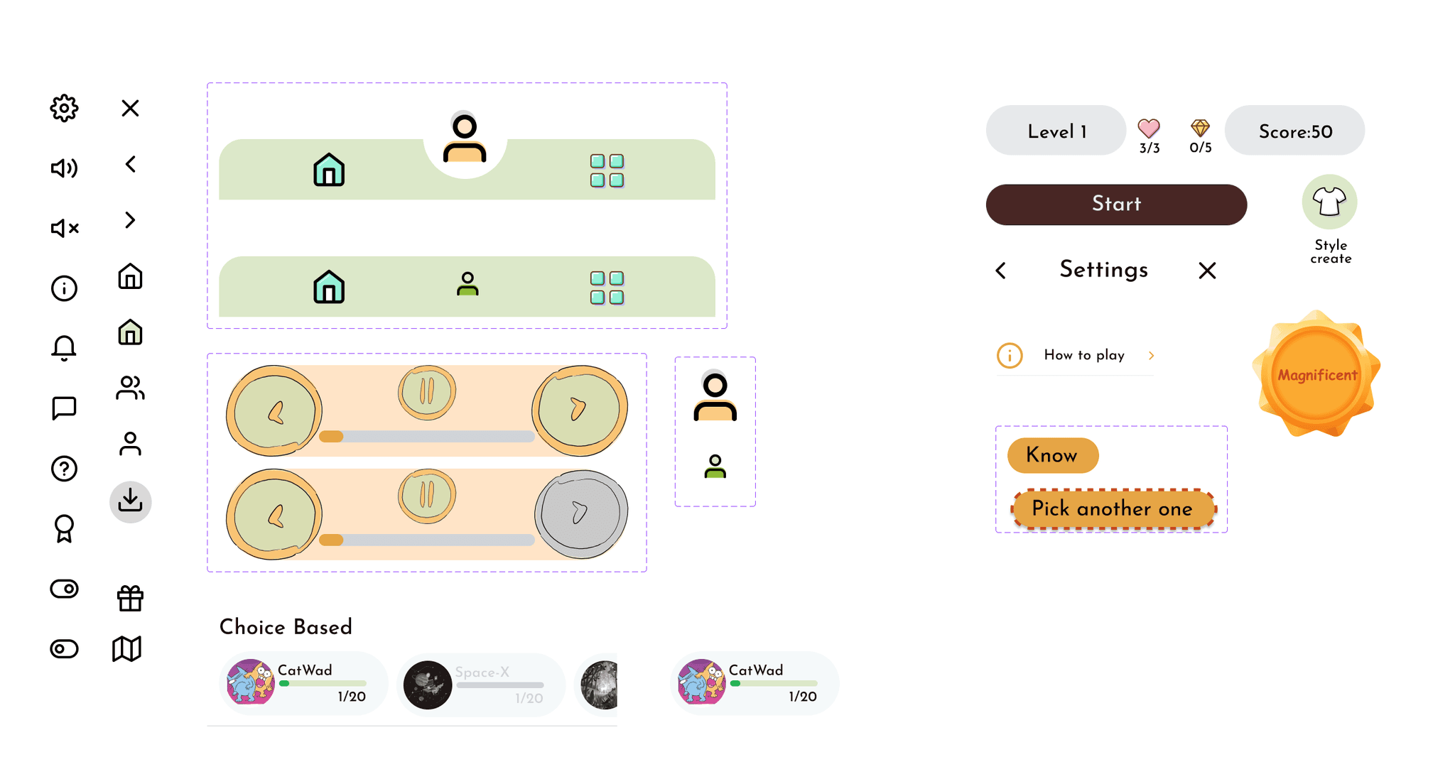
After completing the project, I decided to delve deeper into the app's UI-UX design. I focused on enhancing my use of components, variants, and assets, along with mastering auto-layout and responsive design. I also explored more advanced prototyping and animation techniques. To begin, I developed a well-organized style guide that includes color styles, font styles, icons, and component variants for a more efficient workflow.

Final Prototype & Gamification
Finalizing the prototype, I introduced several game elements and strategies such as:
In-game tutorials;
Using finite number of tries (lives) to have a break, therefore adding failure and game over states;
Game/E-book navigation as buttons on the left and right margin;
Badge collection;
In-game navigation: pause button , setting in title screen, and navigation bar;
Level selector;
Adding a reward system for motivating and hooking;
Adding different genres to choose from, categorized by types of games instead of theme. This would be for example: choice-based, RPG, survival, strategy, etc.
Adding a profile in which you can customize your character, add friends, and look at your journey map, rewards, and achievements.


Just start playing!
Choose a genre, start reading and answering questions about difficult words!
Build your profile and connect with friends!
Personalize your character, add and track your friends' achievements, share!
Choose a storyline, answer correct to get rewarded!
Recognize that this is not just a reading app, it is a reading GAME, and you can win!
At the end of each game, play a challenge to collect badges!
Make your leader board shiny, doing word puzzles to learn and have fun!
Reflections for the Future
What Next?
To refine and evolve the app based on user feedback, ensuring it is an effective literacy tool that is fun and educational.
Activities
Developed a design system of components, fonts, and color styles for a professional and organized app interface.
Conducted heuristic evaluations and planned future improvements.
Emphasized the continuous learning of design tools like Figma to improve the prototype's usability and interactivity.
More Works …
It's not Simple
Immersive, multi-perspective exhibition design on unconscious biases (coming soon…)
Back to Top

